Job Application Package

Application Package Files:

Amedea Tassinari – Cover Letter
Amedea Tassinari – Traditional Resume
Amedea_Tassinari_Resume
Chiat Creative Internship – Job Description

MEMORANDUM

TO: Madeleine Sorapure
FROM: Amedea Tassinari
DATE: March 11th, 2015
SUBJECT: Creative Internship Application Package

This application package was assembled for a Creative Internship at TBWA/Chiat/Day, an advertising agency in Los Angeles with clients such as Airbnb, Adidas, Gatorade, Apple, and more. Attached above is the job description for more information on the intern position, and more information on the agency, it’s clients, and it’s culture can be found at tbwachiatdayla.com.

I maintained a certain style throughout this package that is influenced by this particular agency’s culture: bold, professional, casual, creative, and clean. Additionally, from my experience I have learned that in this industry, passion and personality are key. Therefore, I tried to make my passions and personality clear and consistent across all mediums – the cover letter, traditional resume, and non traditional resume.

My cover letter accomplishes two things. First, it establishes my interest and knowledge about the company, it’s clients, and it’s culture. Second, it makes two claims about how I can be an asset to their agency, and back it up with evidence from my experience. These claims are a mixture or adaptation of what the job description outlines as necessary qualifications for the job. I used personal traits as claims rather than expressing my technical knowledge or talent because I believe my website and portfolio give a better illustration of those aspects of my skills.

I wouldn’t say my traditional resume simply does it’s job, but rather it does it’s job, simply.  While using a creative color scheme and a few graphics, it follows a recognizable format with detailed descriptions about each work experience. I use this resume in situations where employers would not be likely to visit my website. For example, I would use this variation for a printed resume submission. Alternatively, my alternative resume is best used when submitted digitally because my website is just a click away.

The alternative resume, on the other hand, is what I primarily send to creative agencies including TBWA/Chiat/Day. It does not include experience descriptions, so that it can direct readers to the website which is a more informative and interactive medium. The website is emphasized through the peeled back page in the top left corner. After our conversation, I changed the look of the peel so that it utilizes flat design instead of a multidimensional drop shadow.  I think it still produces the “folded” effect without straying away from the look of the document.  In particular, I really like that this format allowed me to use a timeline layout for my experience.  I believe that this really shows growth, and how my experiences evolved over time.

I submitted my application today and will hear back in the beginning of April. Regardless if I am offered an interview or not, I feel as though this package and my website truly put my best foot forward because it is all tailored specifically to the agency, consistent in style across all mediums, and really displays my personality, experience, and creativity.

Sincerely,
Amedea Tassinari

Job Application Package

Personal Business Card

Business_Card_Plastic-01

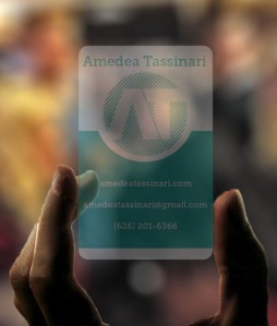
For My personal business card, I incorporated my personal logo with all the necessary information on to one side of the card.  This allows me to make a transparent plastic card, which will really highlight the effects of my logo because the “A” and “T” are cut out of the lines.  In the design above, all of the white text will actually be transparent, not white, more like this mockup:

clear_mockup

Personal Business Card

The Writing Minor Logo

As I already have a personal logo, I decided to try and tackle the creation of the Professional Writing Minor’s logo.  The challenge was to capture the dichotomies that exist in this program – the writing minor is academic and professional, yet modern and fun.  I decided to choose red as a dominant “pop” color for a clean, bold look.

From there, I decided on two variations.  These different logos each have a unique voice.  Let’s take a look:

Variation 1: The Semicolon

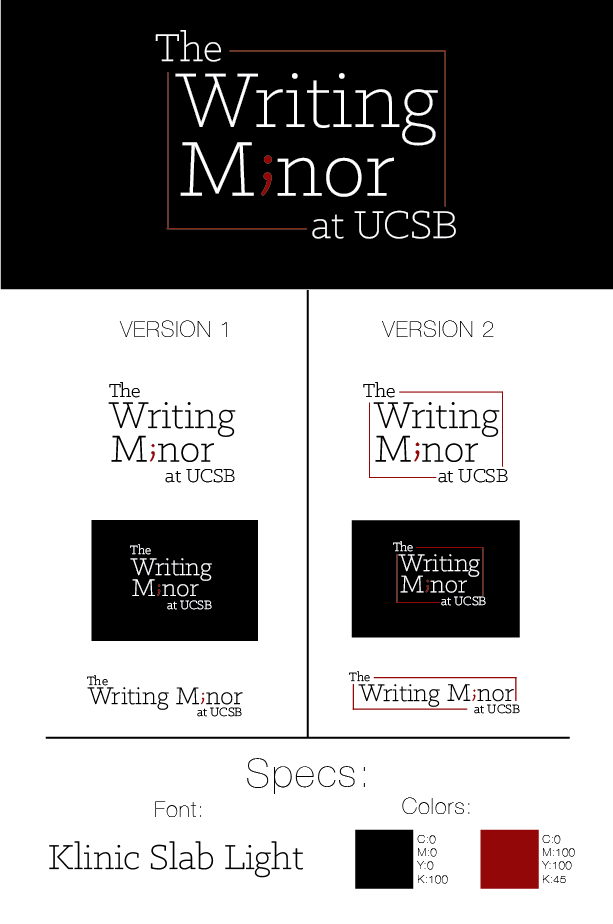
PWMlogo_semicolon

This design uses a semicolon in place of the “i” in “Minor.” The semicolon is a sophisticated form of punctuation, showing the refined quality of writers in this program.  The semicolon’s function is that it joins together two independent clauses; It’s the connector between A and B, so to speak.  The writing minor is an A-to-B connector, too.  As the minor takes place during student’s senior year and involves real world, hands on work, it connects student’s academic experience with their real world experience.

This logo is very sleek, bold, academic, modern, and professional.  Klinic Slab Light is a modern serif font that must have had a typewriter for an ancestor, which calls to mind professional-looking documents.  The bounding box on the logo can be interchangeable (see version 1 and version 2), so that it can be used or deleted according to it’s context.  If the logo is used as a title, it can be used without the bounding box.  If the logo is used as a seal, stamp, or as a small logo, it would be best used with the bounding box because it looks like one cohesive unit.  I also included a horizontal version so that the logo can fit all sizes.

Variation 2: The Word Bubble

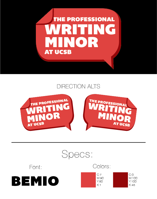
PWMlogo_wordbubble

The word bubble is a classic symbol of spoken words, and furthermore, of communication.  The common denominator between all of the tracks of the professional writing minor is that they teach students to be effective communicators through writing, design, professional documents, and more.  As a unique touch, part of the word bubble if folded over, giving it a texture like the corner of a piece of paper.  Paper is also a common symbol of writing.  This “fold” can be an element of design used for the Writing Minor brand – maybe the first letter of large text can have a little fold, or the corner of a design document can appear folded over to reveal the logo.

This logo is modern, fun, bold, and relevant.  The font is not reminiscent of a type writer unlike the other variation.  It has depth, with it’s darker red shadow, and will really pop on top of a document.  I included two direction alternatives so that the logo can literally point towards important elements on the page.

The Writing Minor Logo

Game Changers Document Re-design: a Memo on the changes.

TO: Madeline Sorapure

FROM: Amedea Tassinari

DATE: January 21st, 2015

SUBJECT: Game Changers Document Redesign

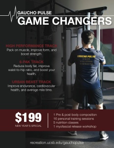
The Game Changers Poster is an advertisement for UCSB Gaucho Pulse’s game changers programs, which is a small group personal training program giving students the opportunity to learn and practice achieving their fitness goals. The primary target audience is students, although non-students are allowed to participate for a larger fee. The goal is to catch attention and make students aware of this brand new program, and primarily to encourage them to sign up or read more on the program’s website.

The original design was not effective in achieving these goals, primarily because of the design. Some of the design problems include:

  • too cluttered with several overlapping photos and not enough white space
  • Needs visual hierarchy – what to look at first?
  • Needs a more authentic/familiar photo choice
  • To much text for the context of these posters (in a gym hallway)
  • Tone needs to be more bold; more eye-catching

The new version of the document (which can be viewed on my last post) was edited to correct these problems using design principles of clarity, authenticity, consistency and repetition, and visual hierarchy. To take away from the clutter and provide familiarity/authenticity, I used one, large photo of a participant wearing the program’s shirt as the background. I cut down on the content significantly, to an amount that the audience can read as they pause between sets of weightlifting at the Rec Cen. I created a red, white, and black color scheme to create consistency throughout the document. I arranged and sized the text to create an intentional visual hierarchy that shows the title first, the information second, and the details last.

I believe that this re-design solves the previously mentioned design flaws, allowing it to achieve it’s original purpose: to catch the attention of prospective participants, and encourage them that the game changers program is worth their time and money.

Game Changers Document Re-design: a Memo on the changes.

Document Re-design: selection and critique

All Game Changer Programs Poster

Critique based on the CARP principles:

Contrast:

  • all text is cap locks, not enough contrast in font type or size
  • overlapping photos takes away from contrast
  • needs more white space

Alignment:

  • some alignment slightly off
  • no leading lines or eye lines

Repetition:

  • good on remaining consistent with colors

Proximity

  • needs more of a visual hierarchy
  • what to look at first?

Other:

  • authenticity/familiarity: need real, non stock photos to be persuasive.  Can be achieved by placing it in a familiar setting like the UCSB Rec Cen, and by using models with a familiar body in terms of age, fitness level, gender, ect.
  • context: these posters have a particular physical context – they are in front of the gym or in hallways, not in your hand.  This means that paragraph style text is ver ineffective – people don’e have time to read as they are passing by.  Since no one will read it, important text gets hidden in the cloud of words.  To fix, pull out the important info and provide a website where they can read more or sign up.
  • needs to be more unique & eye catching to stand out.
  • tone: needs to be more bold and edgy.
Document Re-design: selection and critique

Running from a Tsunami: An Anti-Selfie

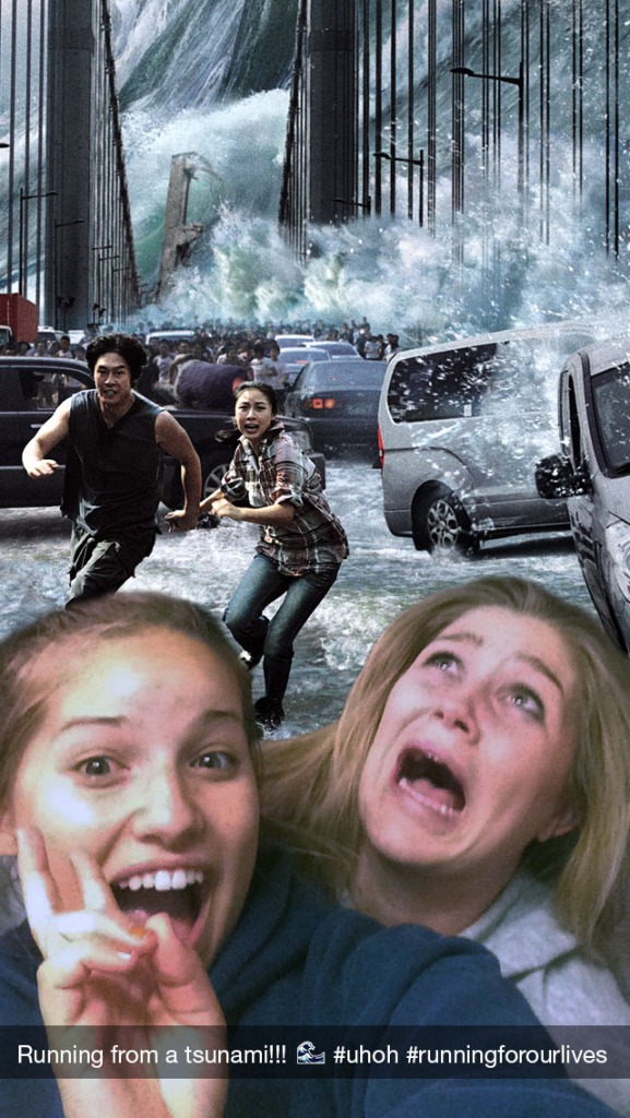
It has become a norm in our culture to document the sometimes exciting (but mostly the mundane) events in our lives through taking a selfie and blasting it on the long list of social media outlets.  The mentality is that putting your face in the photo with a particular background proves that you were there; basically, pics or it didn’t happen. If you didn’t take a picture of the filtered-pink sunset off of your oceanside DP balcony, did it even happen? Of course it did.  You managed to escape from the blazing house fire on Rider St.? Prove it.  The cop who caught you speeding 45mph above the speed limit was cute? how cute?

My friend and I took this photo during the great San Francisco tsunami of 2014.  To, me it says: I was there, we survived.

tsunami_selfie_2

Running from a Tsunami: An Anti-Selfie